UX UI, WEB DEV
Archive
Past project archive with summaries of the client, problems, solutions, outcomes, challenges, and examples of the final design
Pandos namai
Client
BT Projektai, 2021
My role
UX UI, WEB DEV
Overview
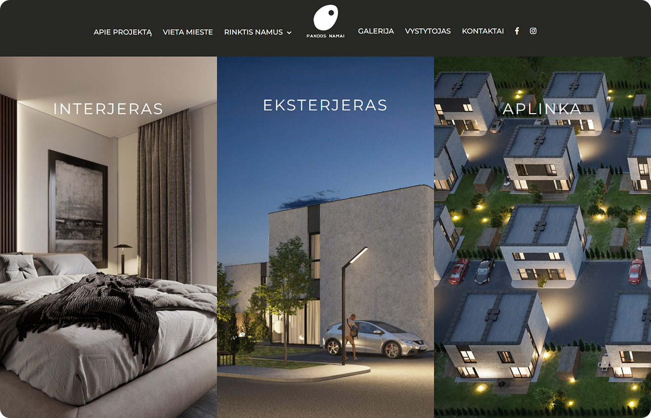
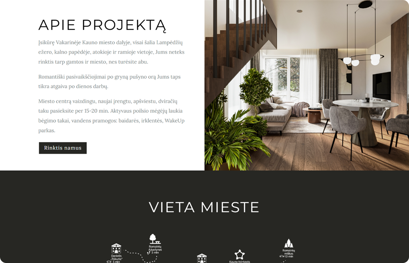
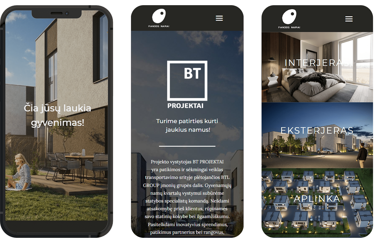
BT Projektai is a real estate agency currently marketing Pandos Namai, a new townhouse complex in downtown Kaunas. With 48 homes available, either as whole townhouses or split into condominiums, the project needed an effective way to reach potential buyers before construction was complete. As competition in Lithuania’s real estate market intensifies, agencies must maximize their visibility and accessibility.
Solution
To establish an strong brand recognition, differentiation, accesibility and optimized e-commerce experience, the project focused on solving these problems:
- Lack of a physical showcase for potential buyers → Since the complex was still under construction, buyers could not visit the townhouses in person. The website serves as a digital showroom, providing all necessary details, technical specifications, and visualizations to help buyers make informed decisions.
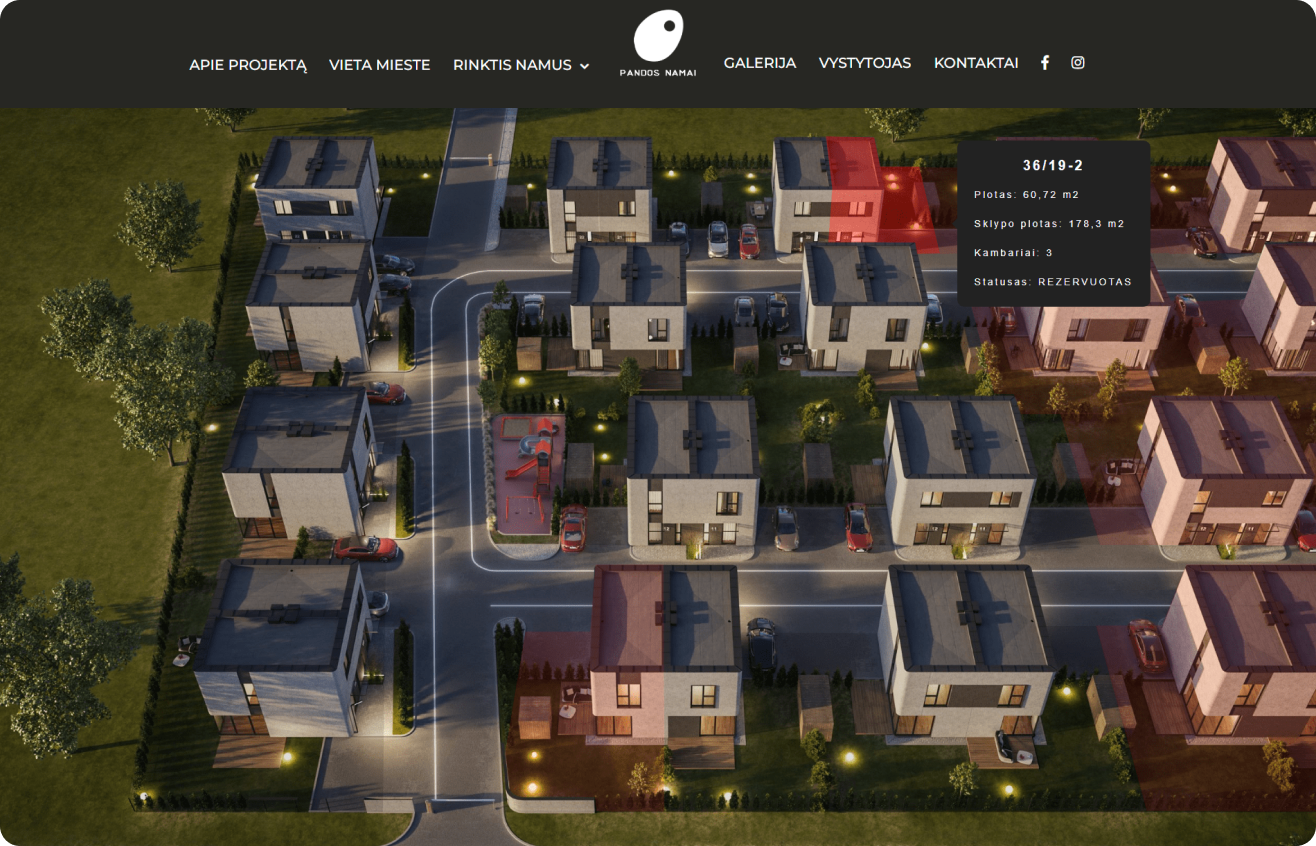
- Complex purchasing options causing confusion → Buyers could purchase a full townhouse or one of the two separate condominiums. To avoid misunderstandings, the website implemented clear visual distinctions and guided navigation to streamline the selection process.
- Limited reach and inefficient sales process → With increasing competition in the real estate market, the agency needed a platform to attract, inform, and convert potential buyers. The website integrates a reservation system and online payment options, allowing users to reserve homes easily and reducing friction in the buying process.
Constraints
The project had a strict three-month timeline and a limited budget, requiring a focused, efficient approach. The key challenge of this project, ensuring users and administrators clearly distinguished between purchasing a full townhouse or a single condominium, by using distinct visual elements and interactions.
Outcomes
The website was successfully developed, launched on schedule, and finalized after minor content refinements. This project highlighted the importance of a well-structured, visually detailed real estate website in the sales process, especially when physical property visits are not possible, ensuring that buyers can clearly envision the property.
Cerami
Client
Case study, 2021
My role
UX UI
Overview
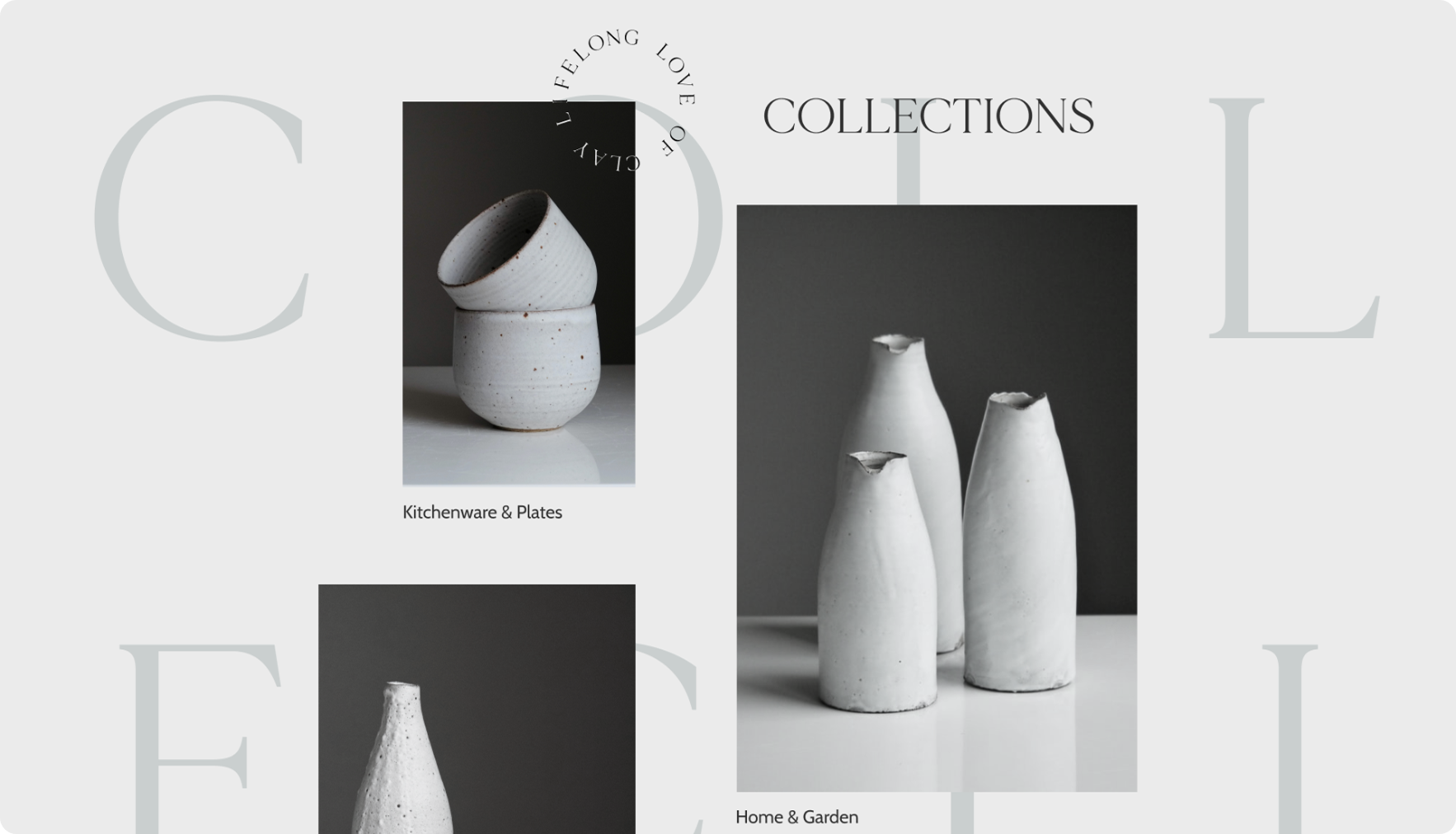
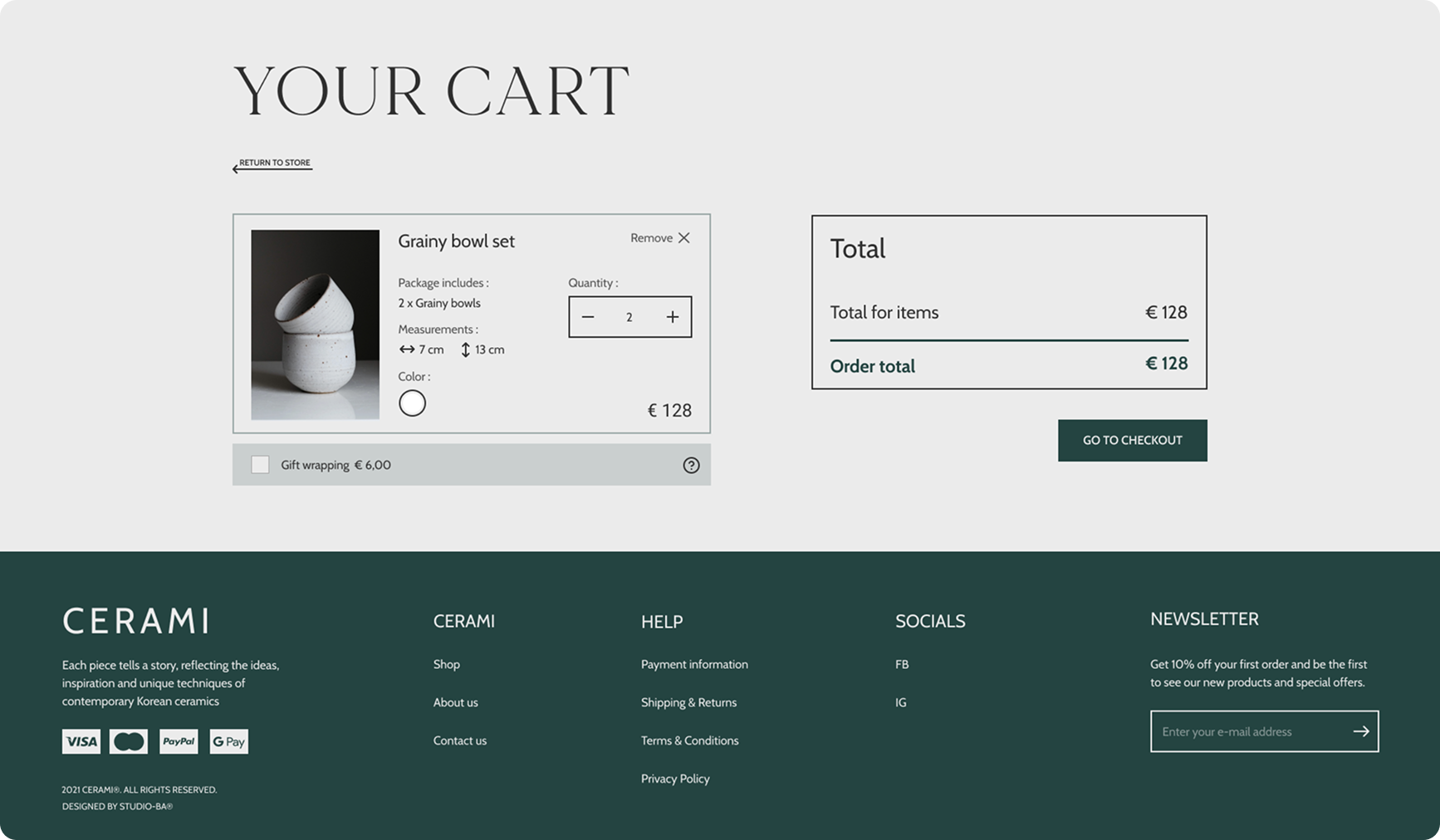
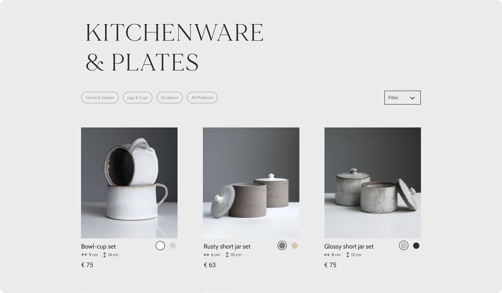
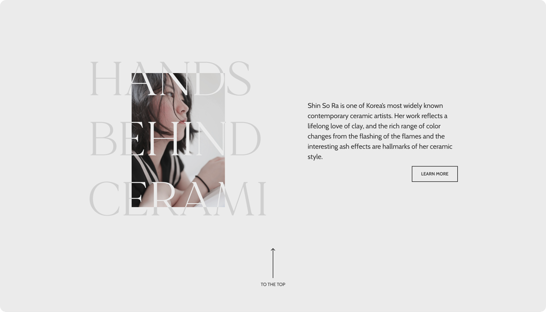
Cerami is a fictional Lithuanian ceramic studio catering primarily to international customers, emphasizing sustainability, slow living, and minimalism. Until now, sales were driven through word of mouth, craft fairs, and social media, which proved unreliable and limiting for international expansion. This case study was created as part of a design bootcamp to explore and refine e-commerce UX/UI design skills.
Solution
To establish an online presence and establish ecommerce store, the project focused on:
- Limited online presence and outdated sales channels → The studio relied on word of mouth, craft fairs, and social media for sales, which proved ineffective for international reach. A modern e-commerce website with a user-friendly design was developed to expand the studio’s reach and improve conversions.
- Lacking brand identity → The initial design lacked a clear and reliable brand image. Through the research and competitive analysis, the website’s visual style was refined to align with the studio’s sustainability and minimalist values, fostering trust with potential customers.
- Avoiding common user experience issues → As market reasearch showed, users find it difficult to navigate and purchase products due to poor website structure and outdated design. Therefore a focus was placed on clear product information, easy checkout, and mobile responsiveness helped create a smooth, convenient user experience.
Constraints
The biggest challenge was finding the right balance between minimalism and a compelling brand personality. Due to time limitations, usability testing was not conducted, leaving room for future improvements.
Outcomes
The final result was an interactive prototype showcasing the website’s design and functionality. This bootcamp project reinforced the importance of creating a visually engaging, user-friendly interface that tells a story and connects with customers on an emotional level.
Mano Dula
Client
K. Galerija, 2021
My role
UX UI, WEB DEV
Overview
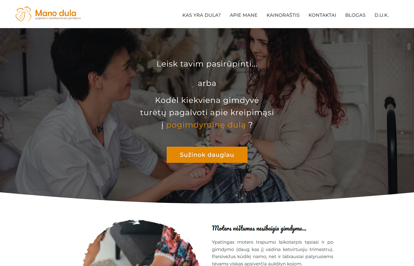
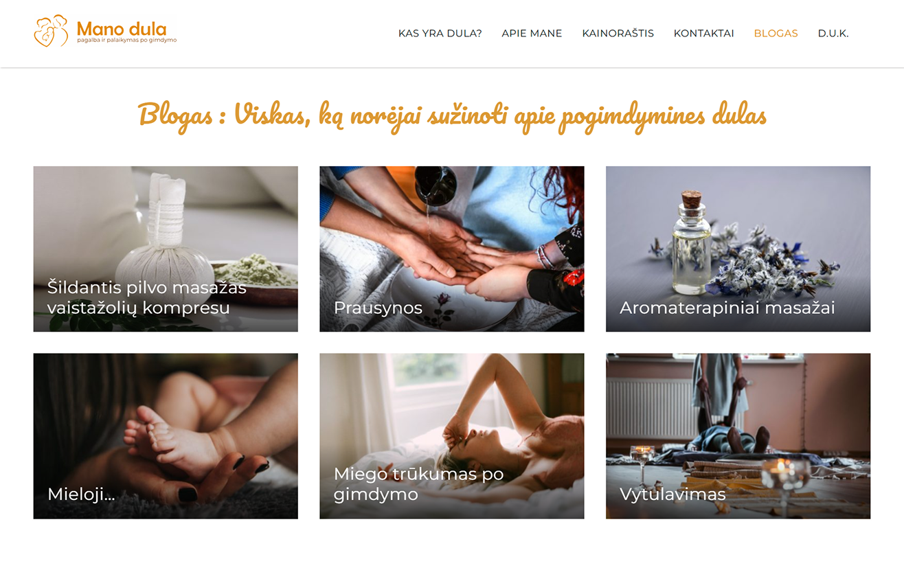
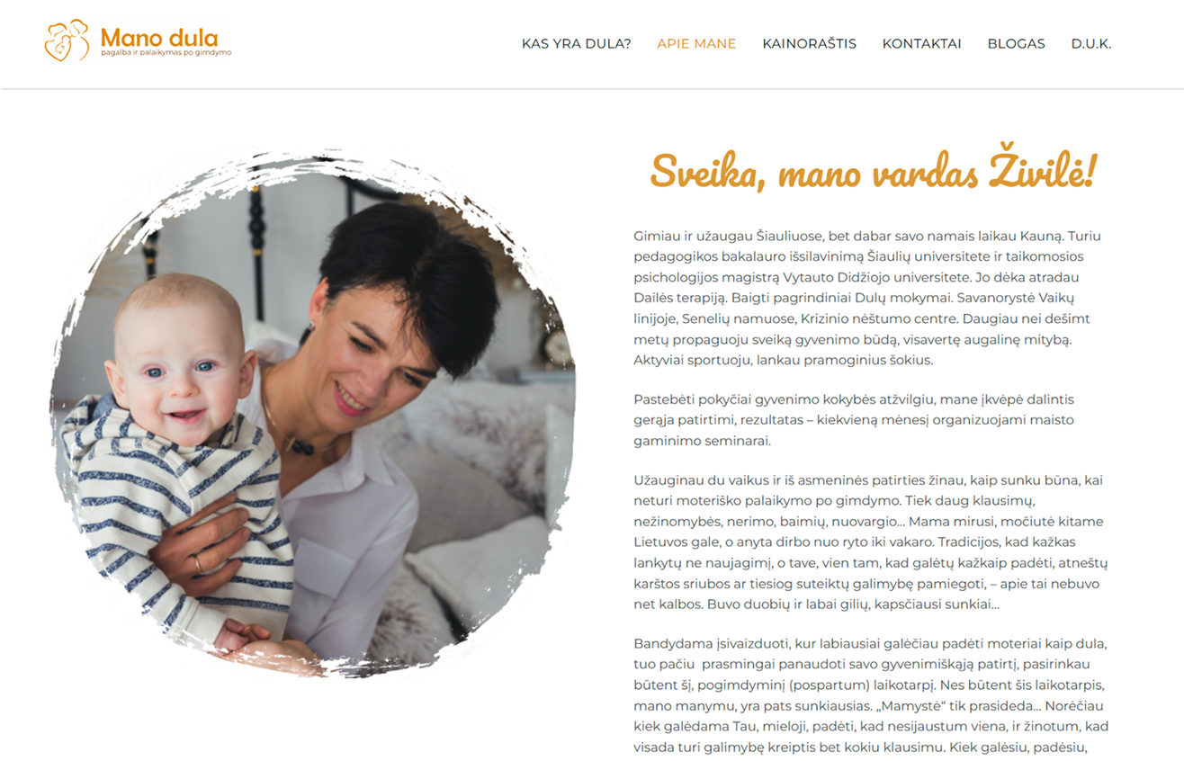
Mano Dula is a project that involved designing and developing a website for Živilė, a postpartum doula. In Lithuania, postpartum doula services are largely unknown and often mistaken for nanny services. Misconceptions and lack of awareness make it difficult for new parents to trust and understand the value of doula support. The goal was to establish a trustworthy, informative, and reassuring online presence that would educate, dispel myths, and help expecting parents feel comfortable seeking postpartum care.
Solution
The project involved a full redesign and development of the e-commerce platform while maintaining Barometrai’s brand identity. Key steps included:
- Lack of awareness and misconceptions → In Lithuania, postpartum doula services are largely unknown and often confused with nanny services. The website was designed to educate expecting parents, clarify misconceptions, and build trust in the doula profession.
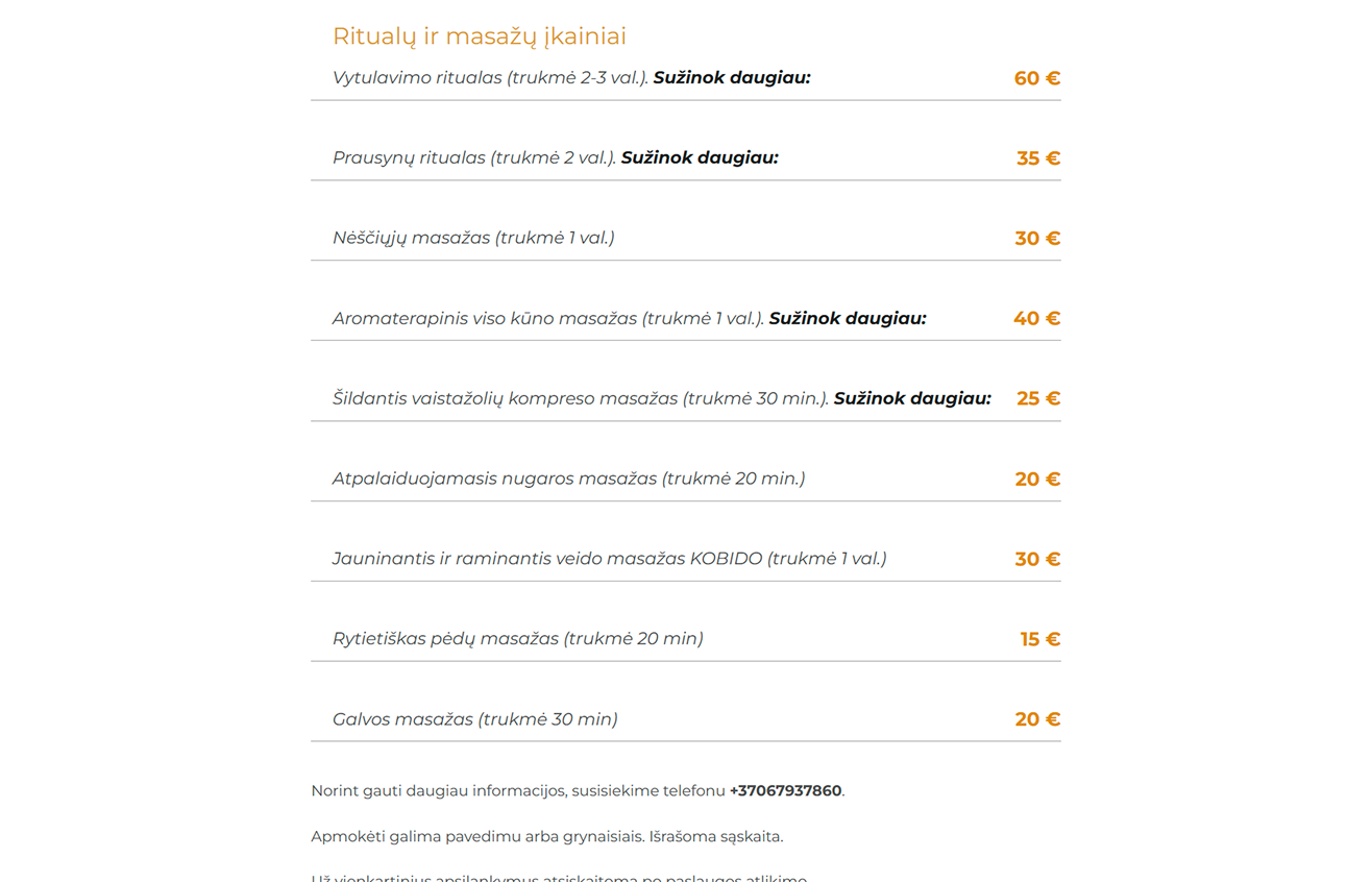
- Need for educational resources → Many parents are unfamiliar with the benefits of postpartum doula support. The website provided informative articles, details on rituals, and additional resources to guide new mothers through this crucial period.
- Strengthening online presence → While social media helped spread awareness, a centralized platform was necessary to provide in-depth information and a direct point of contact. The website served as a center to support existing social channels and improve visibility.
Constraints
The biggest challenge was designing a visually inviting yet professional platform that balanced warmth with credibility. Since postpartum care is deeply personal, the site had to avoid an overly medical or commercial feel while still presenting reliable information.
Outcomes
The successful launch of Mano Dula highlighter the importance of clear, empathetic design in sensitive and intimate service areas.
Keep going
Client
Dalia L., 2021
My role
UX UI
Overview
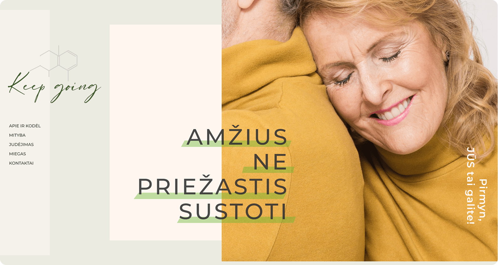
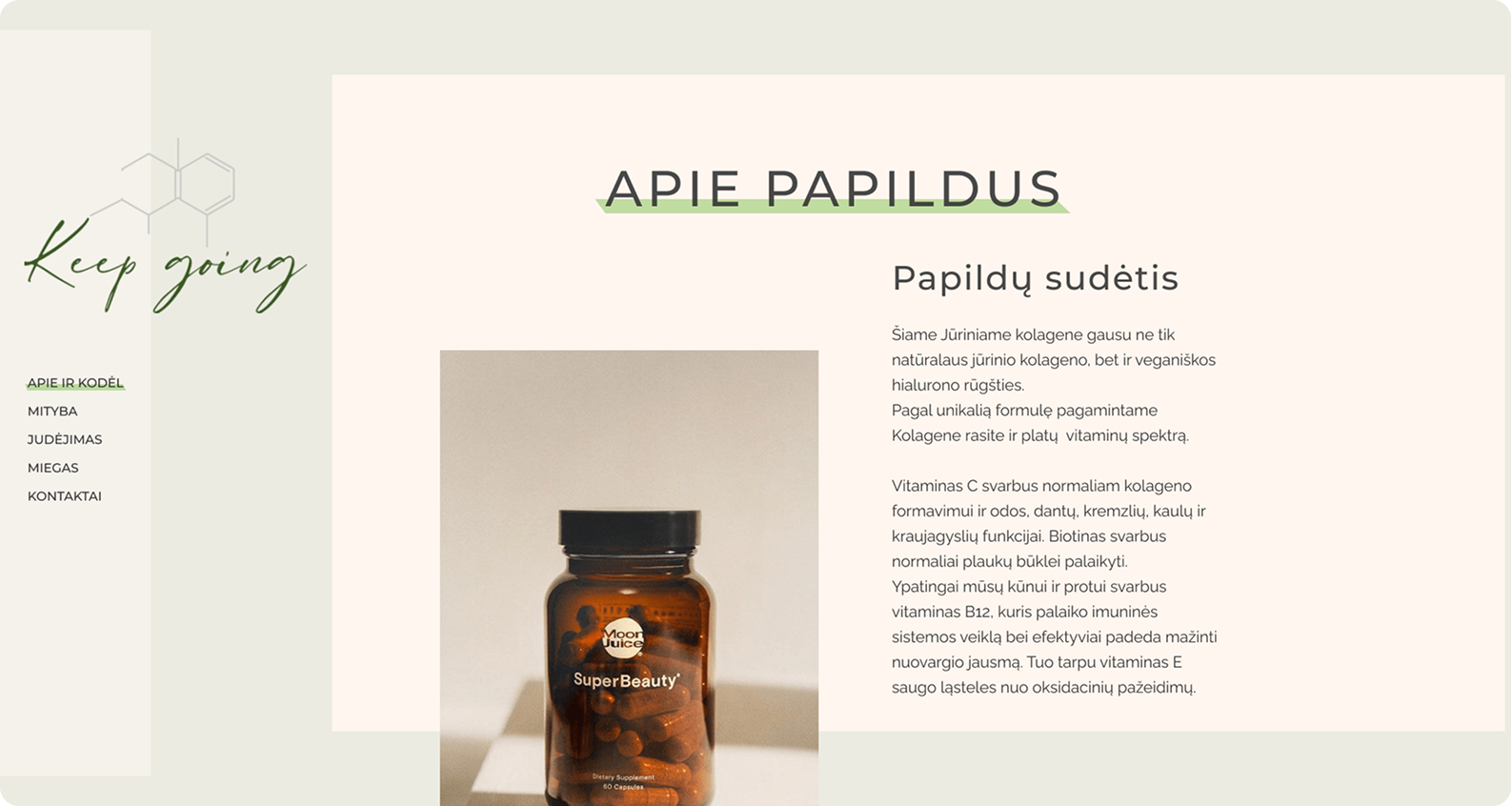
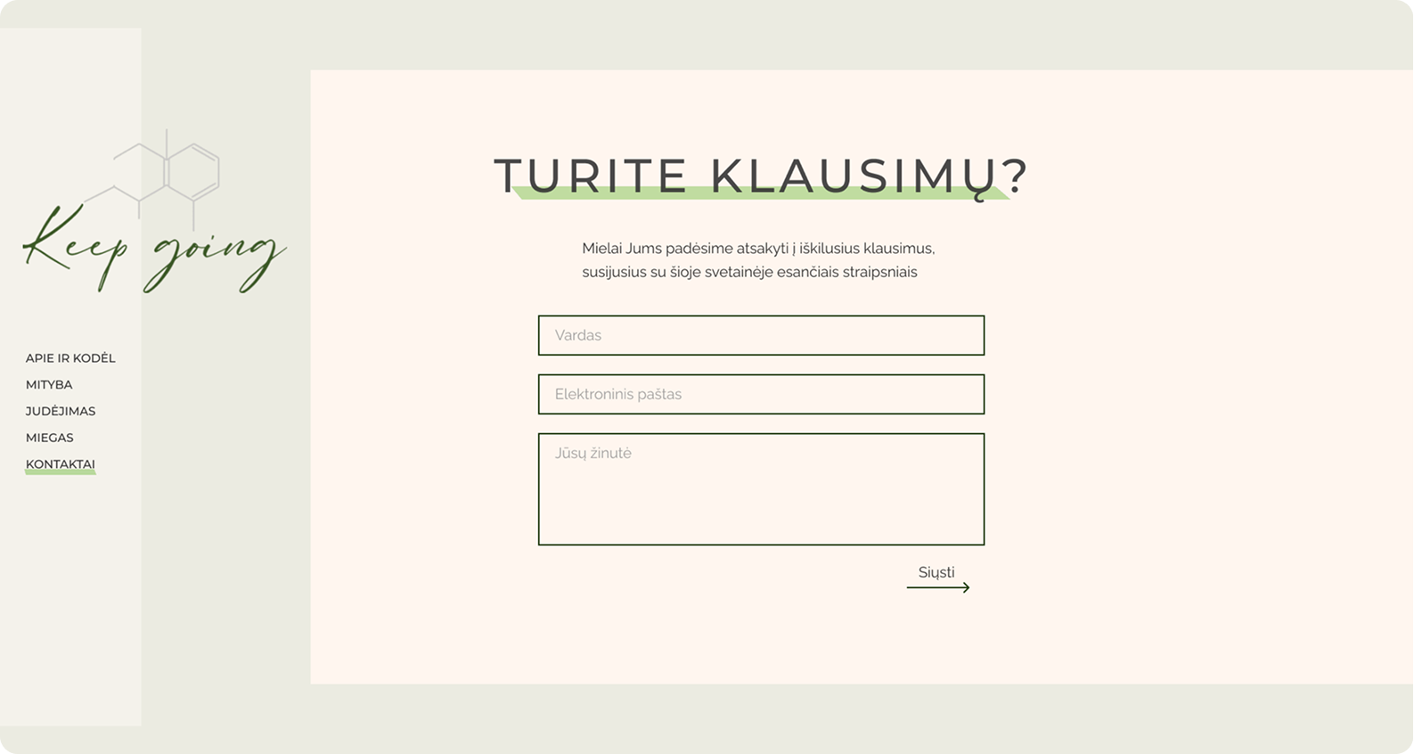
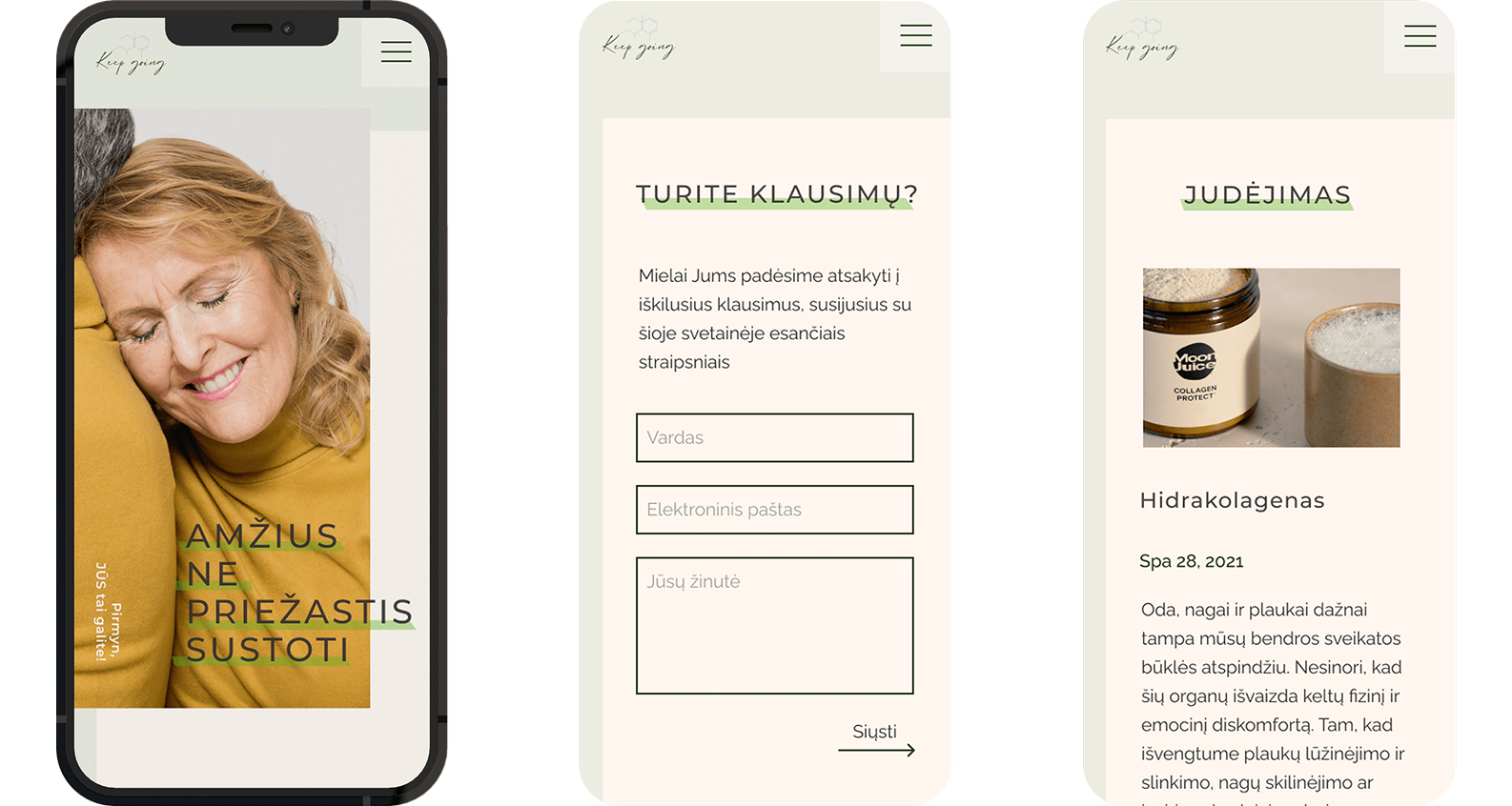
Keep Going was initially conceived as an e-commerce store specializing in anti-aging supplements alongside an educational blog. However, as the project evolved, the focus temporarily shifted exclusively to education. The anti-aging industry in Lithuania primarily centers around beauty procedures, making Keep Going a pioneering initiative in promoting longevity through specialized supplements.
Solution
The project aimed to create an e-commerce store with an integrated blog for consumer education. Key problems and solutions included:
- Lack of awareness about anti-aging supplements → Since these products were new to the Lithuanian market, the primary focus shifted to consumer education. A blog module was developed to inform users about longevity, supplement benefits, and proper usage.
- Building trust in a niche industry → A clean and professional design was developed to appeal to the target audience and establish credibility in the health and wellness sector.
- Frequent project scope changes → Initially designed as an e-commerce site, the project was restructured into an educational platform due to regulatory challenges. The website had to be adjusted multiple times within the same timeline.
Constraints
Frequent design changes were required due to shifting project goals, yet the development timeline remained unchanged.
Outcomes
The project was discontinued after entering development, as the supplements were not approved by the European Medicines Agency. The primary challenge was crafting a visual identity that communicated credibility and the anti-aging message effectively.
Proktologas
Client
Edita U., 2020
My role
UX UI, WEB DEV
Overview
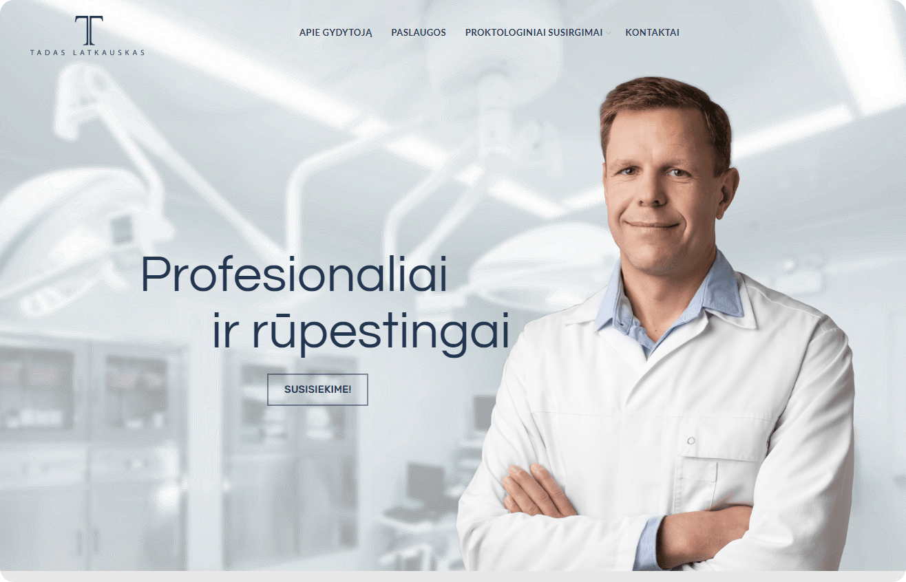
MD PhD Tadas Latkauskas, a Kaunas-based proctologist and surgeon, lacked an online presence, making it difficult for patients to contact him directly. In Lithuania, healthcare professionals primarily rely on a public booking system, which limits accessibility and convenience for urgent or private consultations.
Solution
The project involved designing and developing a personal website for MD PhD Tadas Latkauskas, addressing key challenges and strategic goals:
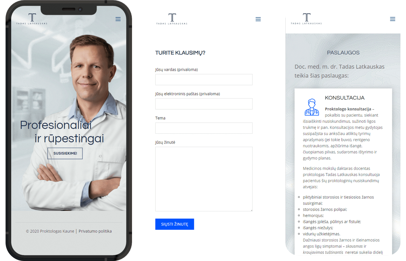
- Lack of online presence and direct communication → The website provides a centralized platform for patients to learn about services, access resources, and book consultations more easily.
- Missed opportunities and limited brand visibility → Without an online or social media presence, potential clients had no way to discover or engage with Dr. Latkauskas. The website serves as a personal branding tool, increasing visibility, credibility, and patient trust.
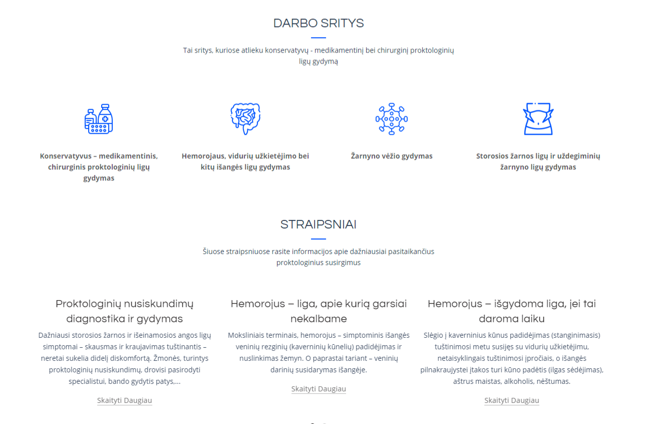
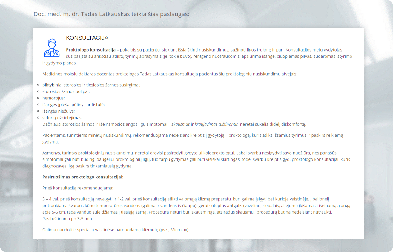
- Need for patient education and informed decision-making → The website includes detailed explanations, treatment options, and professional insights, helping patients with knowledge before consultations.
- Long-term website manageability → Dr. Latkauskas needed a site that could be updated independently without ongoing developer involvement. A user-friendly CMS was implemented, ensuring easy content updates and flexibility.
Constraints
The website needed a convenient CMS to allow Mr. Latkauskas to manage and edit content independently, reducing reliance on developers.
Outcomes
The website launched successfully, providing an accessible platform for patients while supporting Mr. Latkauskas’ expertise. The project highlighted the importance of user-friendly content management for long-term website sustainability.
Unijoga
Client
Unijoga, 2020
My role
UX UI, WEB DEV
Overview
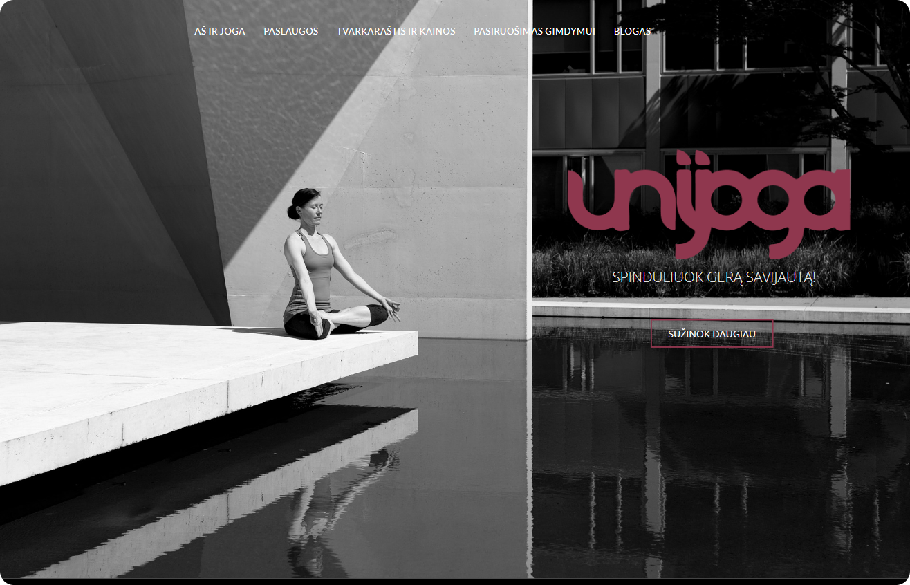
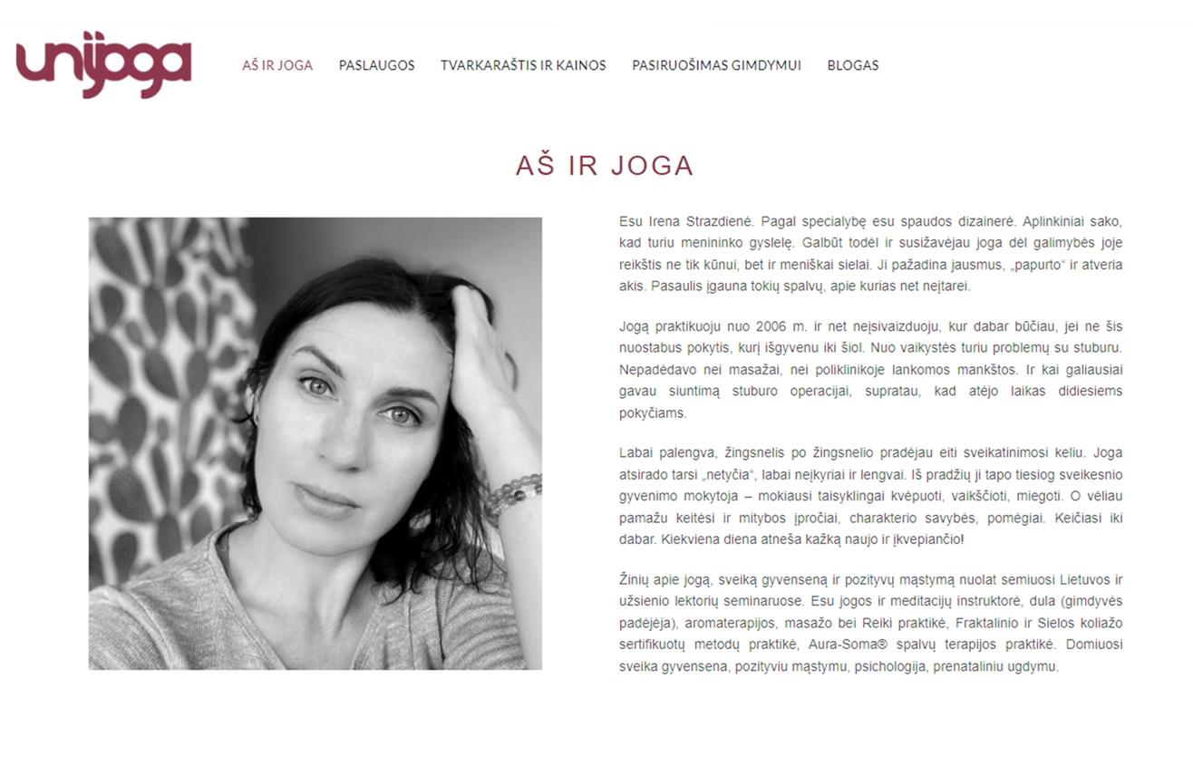
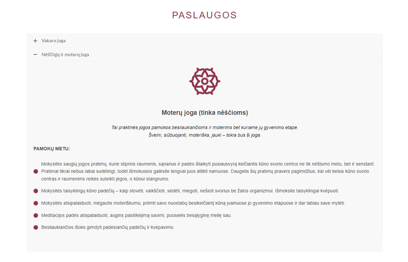
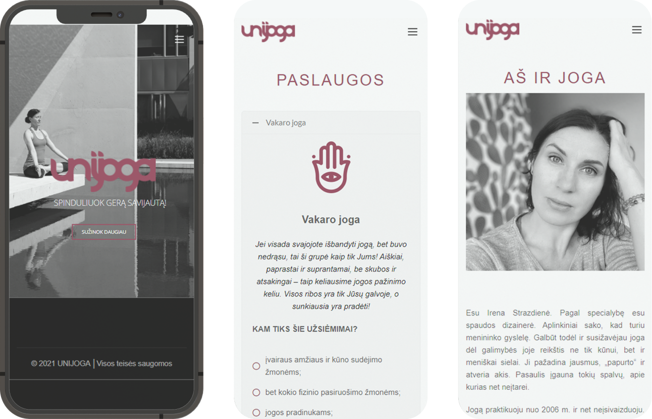
Unijoga, a Kaunas-based yoga studio, offers yoga classes, meditation, and specialized prenatal and postnatal courses. Its outdated 10-year-old website suffered from poor navigation, information overload, and lack of responsiveness, making it difficult for clients to access essential details.
Solution
The project involved a complete redesign and development of the website, focusing on user pain points and business goals. Key problems and solutions:
- Lack of a centralized platform and limited online visibility → A structured, user-friendly website that centralizes all key information, making it easy for users to learn about Unijoga’s services, join classes, and engage with the community. The redesign also enhances online reachability and supports membership growth.
- Dated look, non-responsive design, information overload, and navigation challenges → A refreshed online presence with a modern, responsive design, improved content organization, and intuitive navigation, ensuring a seamless and enjoyable user experience.
Constraints
The redesign had to be completed within two months to align with autumn class registration. Iterations based on client feedback ensured effective solutions under tight timelines.
Outcomes
The revamped website launched successfully, addressing user needs and improving the studio’s online presence. The project emphasized how effective information organization is crucial to improving user experience.
Barometrai
Client
K. Galerija, 2021
My role
UX UI, WEB DEV
Overview
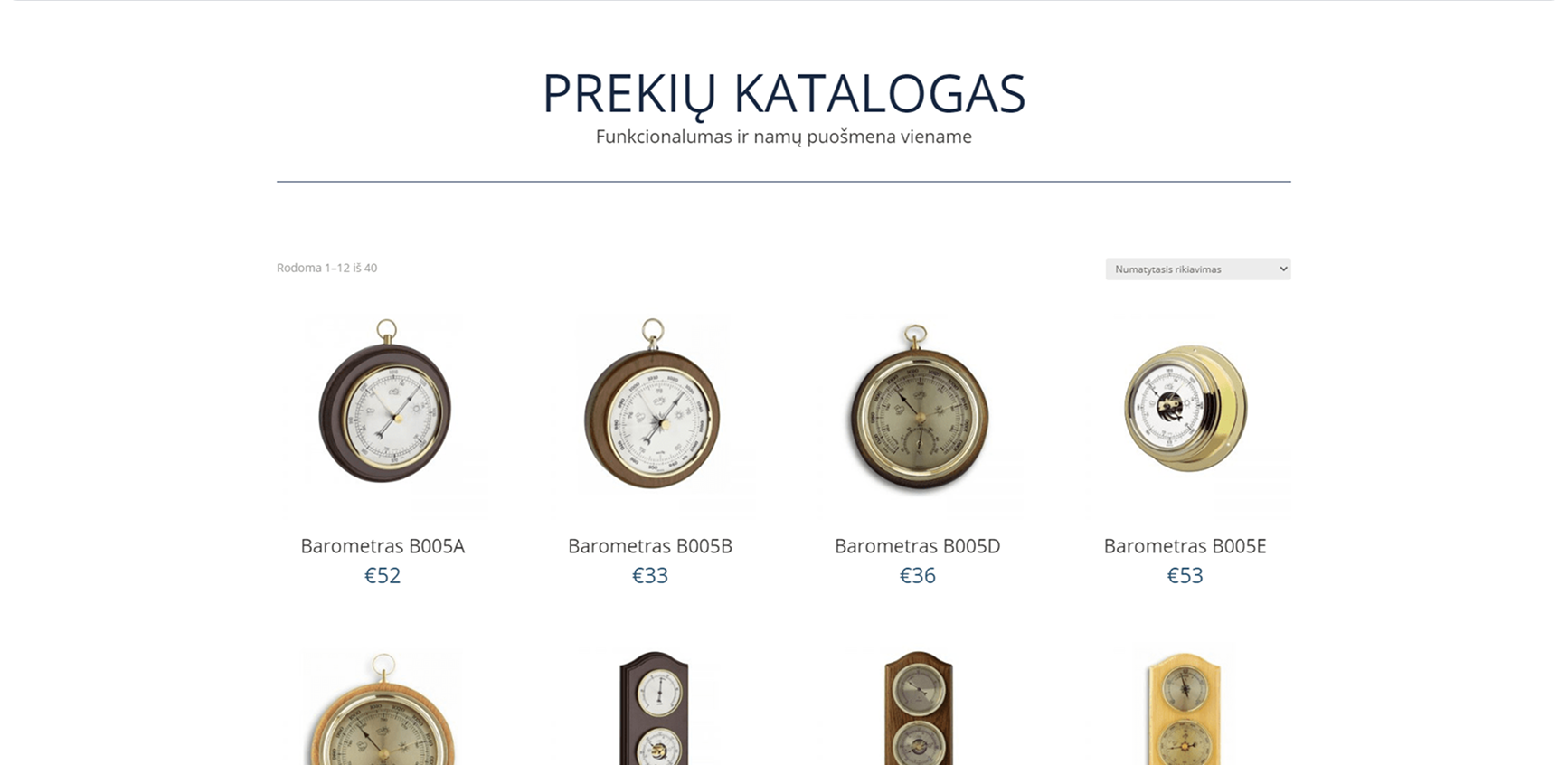
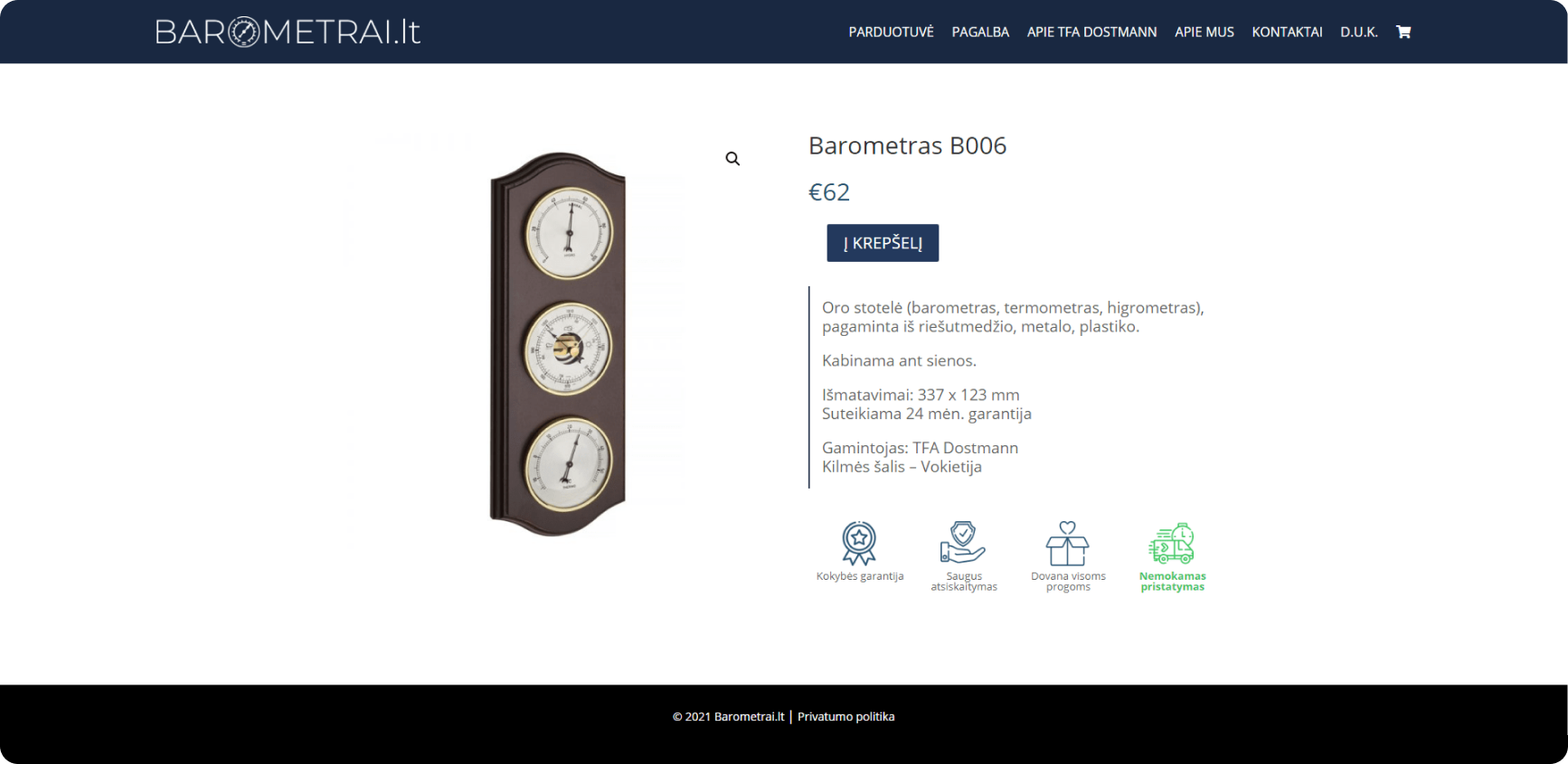
Barometrai, Lithuania’s largest e-commerce store for barometers and thermometers, represents TFA Dostmann, a European leader in weather instruments. Despite operating since 2010, the website remained unchanged for over a decade, lacking key e-commerce functionalities.
Solution
The project involved a complete redesign and development of Barometrai’s e-commerce store, addressing key challenges and strategic goals:
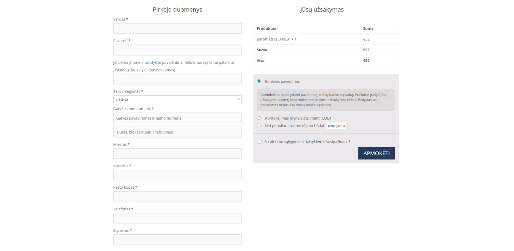
- Outdated website with limited functionality → Despite being an e-commerce store, the website lacked essential features like a payment system, shopping cart, and intuitive product sorting. The new site was designed to support seamless online transactions and improve the shopping experience.
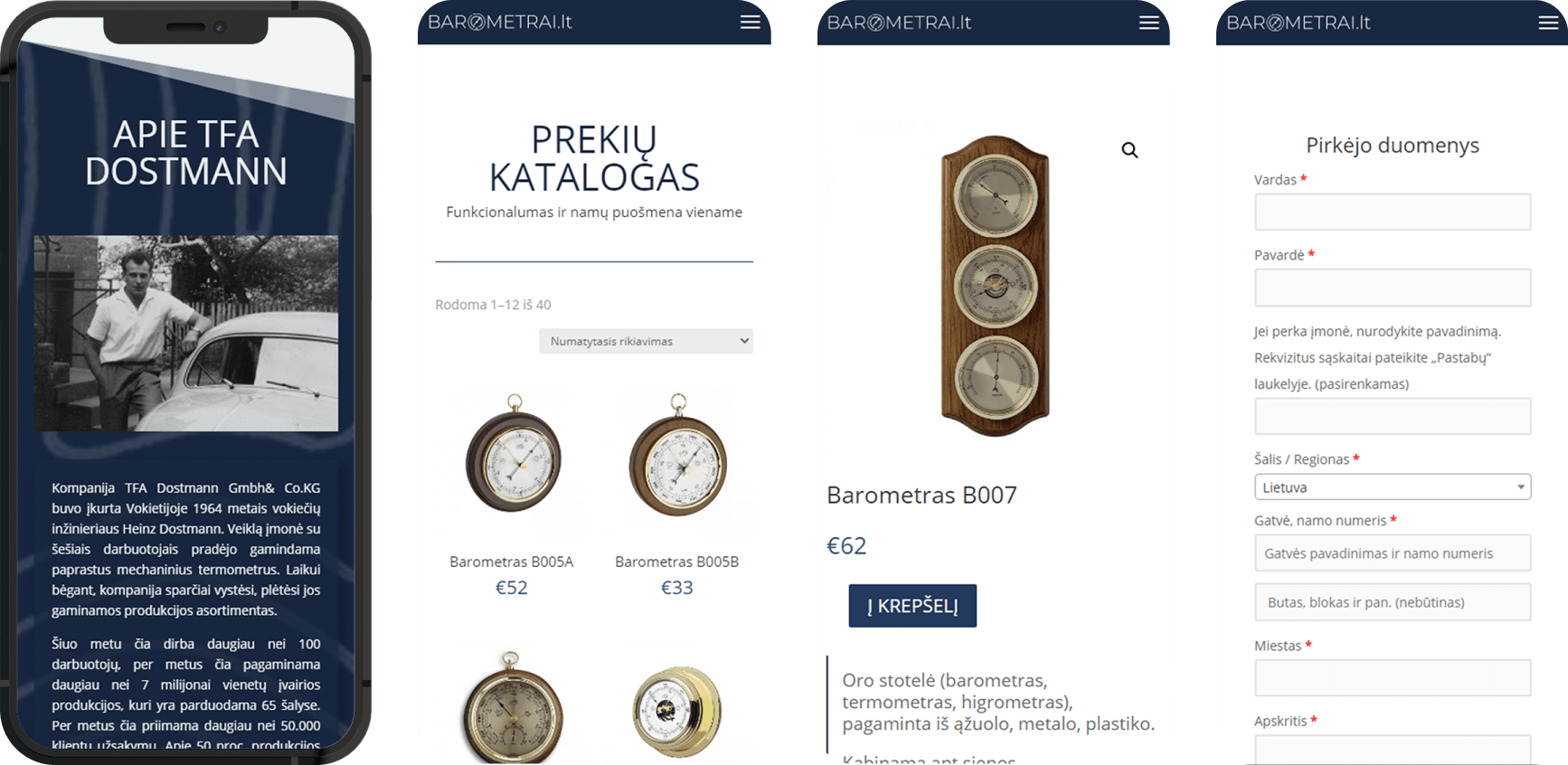
- Poor user experience and non-responsive design → The existing site had an outdated interface that was not optimized for different screen sizes, making navigation difficult. The redesign introduced a clean, responsive layout, ensuring accessibility across devices.
- Need for scalability and market expansion → With plans to expand into Latvia and Estonia, the new platform was built to accommodate future growth while maintaining Barometrai’s brand identity.
- Budget constraints and long-term manageability → The project required a simple yet appealing design that prioritized usability over visuals. A cost-effective approach was taken, and a user-friendly CMS was implemented to allow easy updates by the administrator.
Constraints
A tight budget required a focus on simplicity and usability rather than complex visuals. The website also needed a user-friendly CMS to allow independent content management.
Outcomes
The project was successfully developed and emphasized designing a clean, minimal, and effective e-commerce experience while working within financial constraints.